Bryne Kitchen
This guest post was written by my clients, Christy and Michael Bryne. Here they share their kitchen renovation story. I had the privilege of working with Christy and Michael, and I’m amazed at their hard work and dedication to making their dream kitchen come to life.
Christy Bryne in her new kitchen.
Michael and I spent 8 months trying to buy this old house For Sale By Owner from a man who raised his 5 kids in this home and had very emotional attachments to it. During our search we kept coming back to this house and knew that we had to make it work. Our vision was always for a big kitchen that was a gathering place. We love to cook and we wanted a space that fit a crowd. We searched kitchen ideas on Pinterest and our main inspiration came from a photo we saw on designer, Becki Owens, Instagram. It was warm and pretty, unique but classic, it combined materials and colors. Looking at pictures was easy and fun, but actually making the decisions was stressful.
BEFORE & DURING
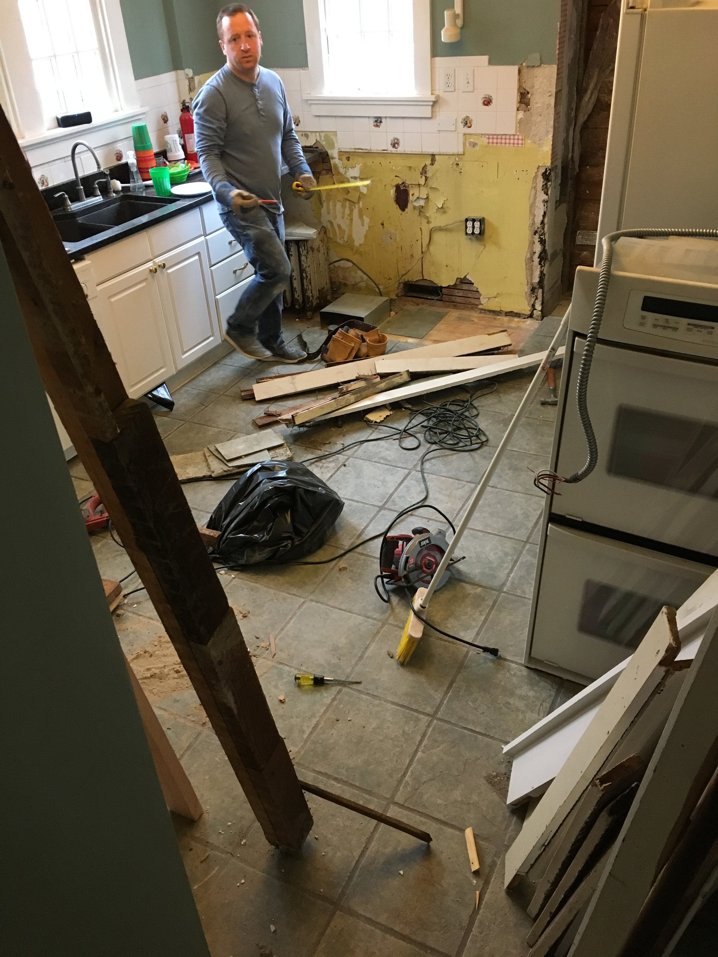
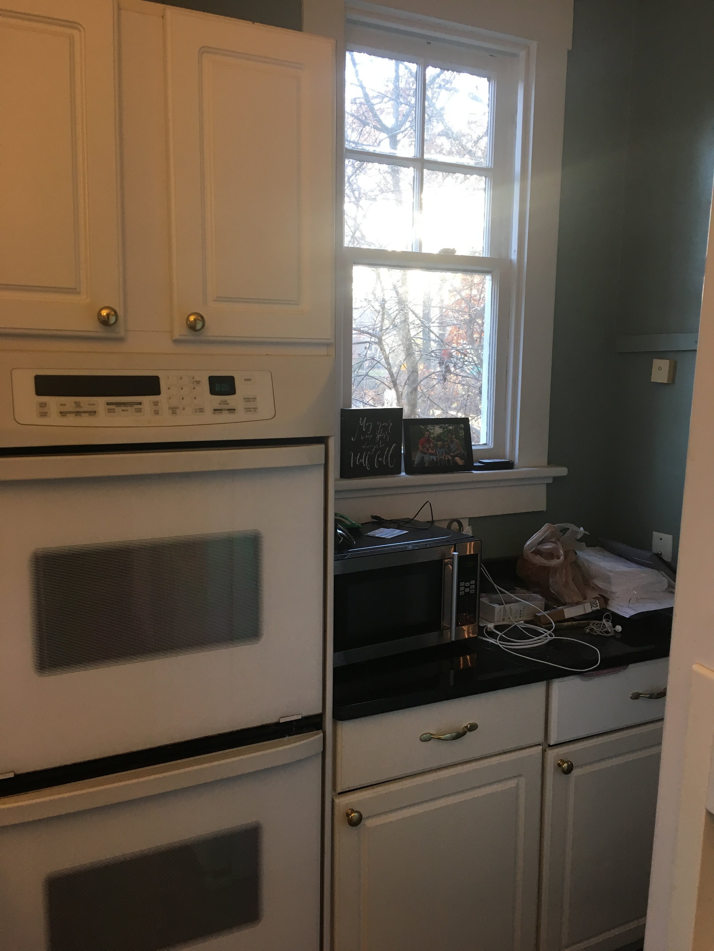
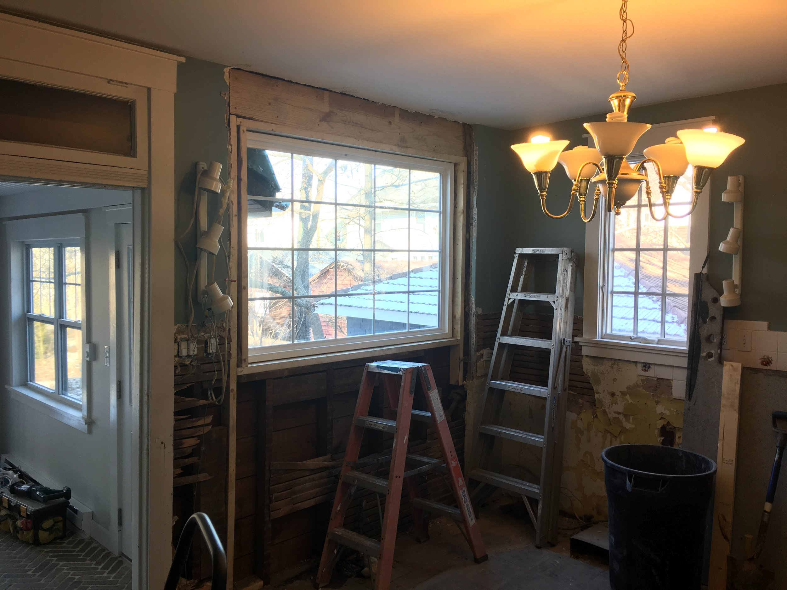
Before the renovation
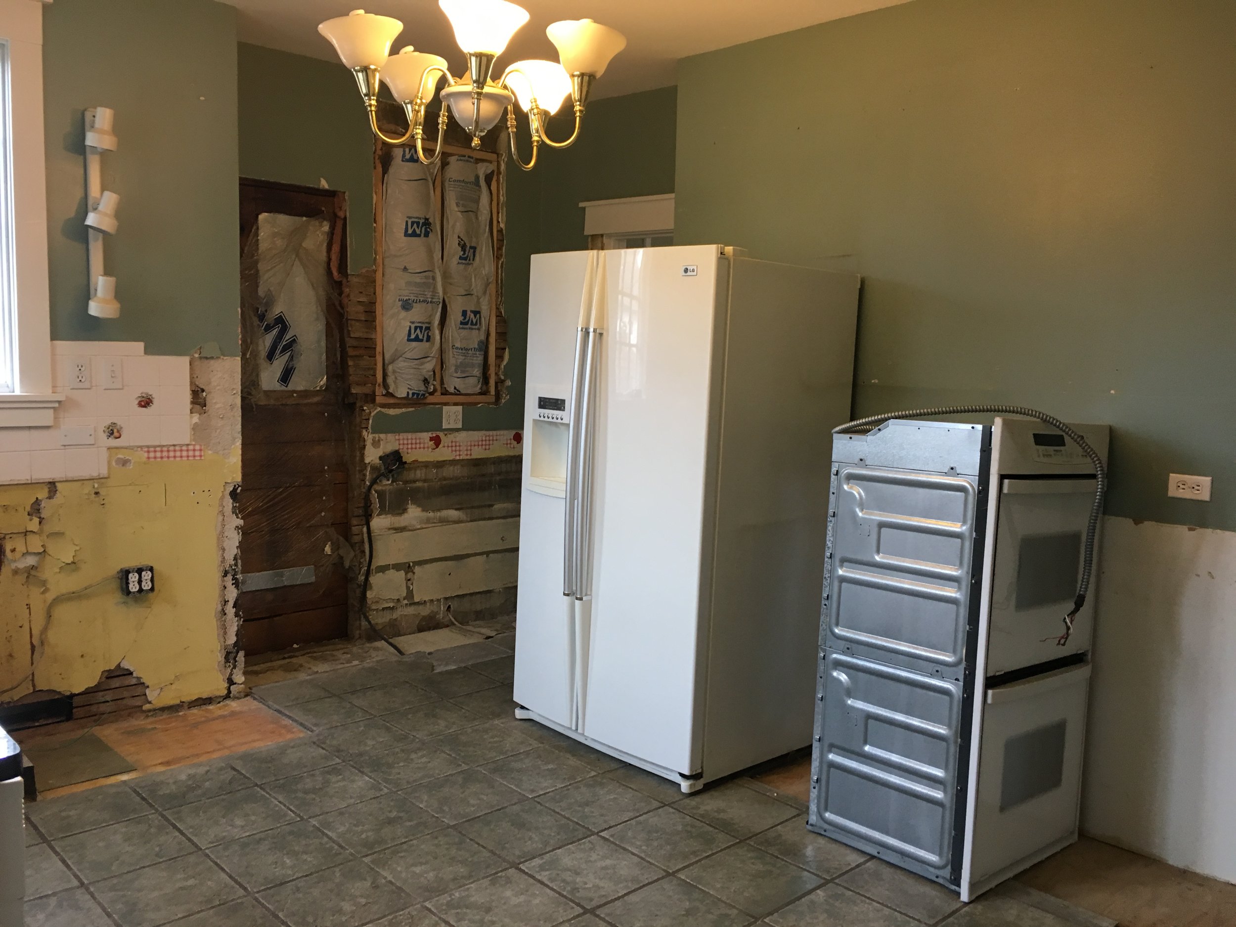
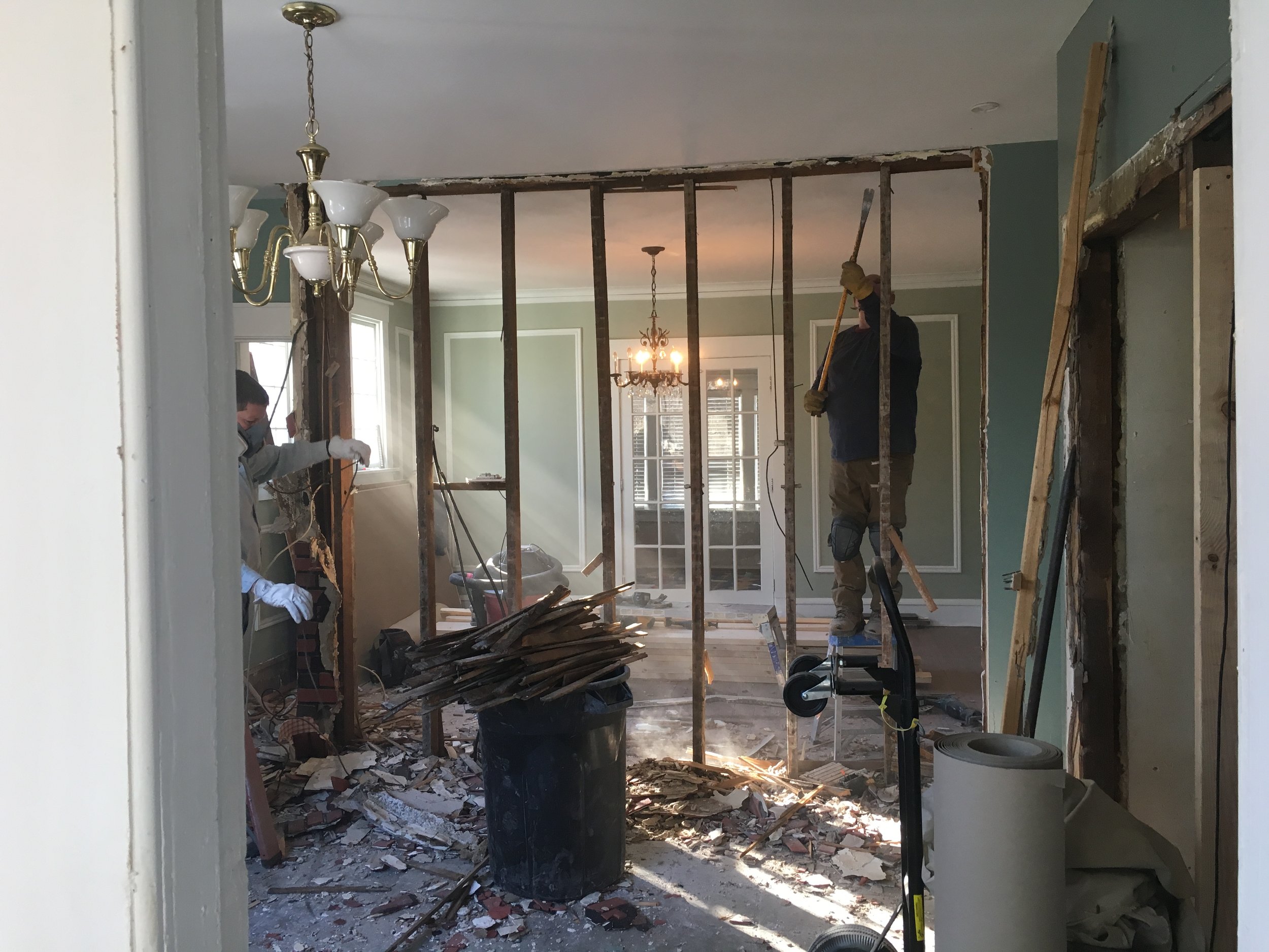
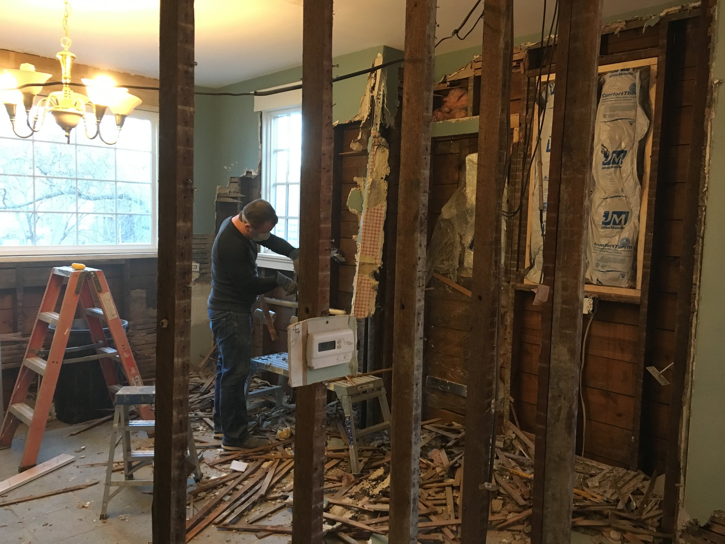
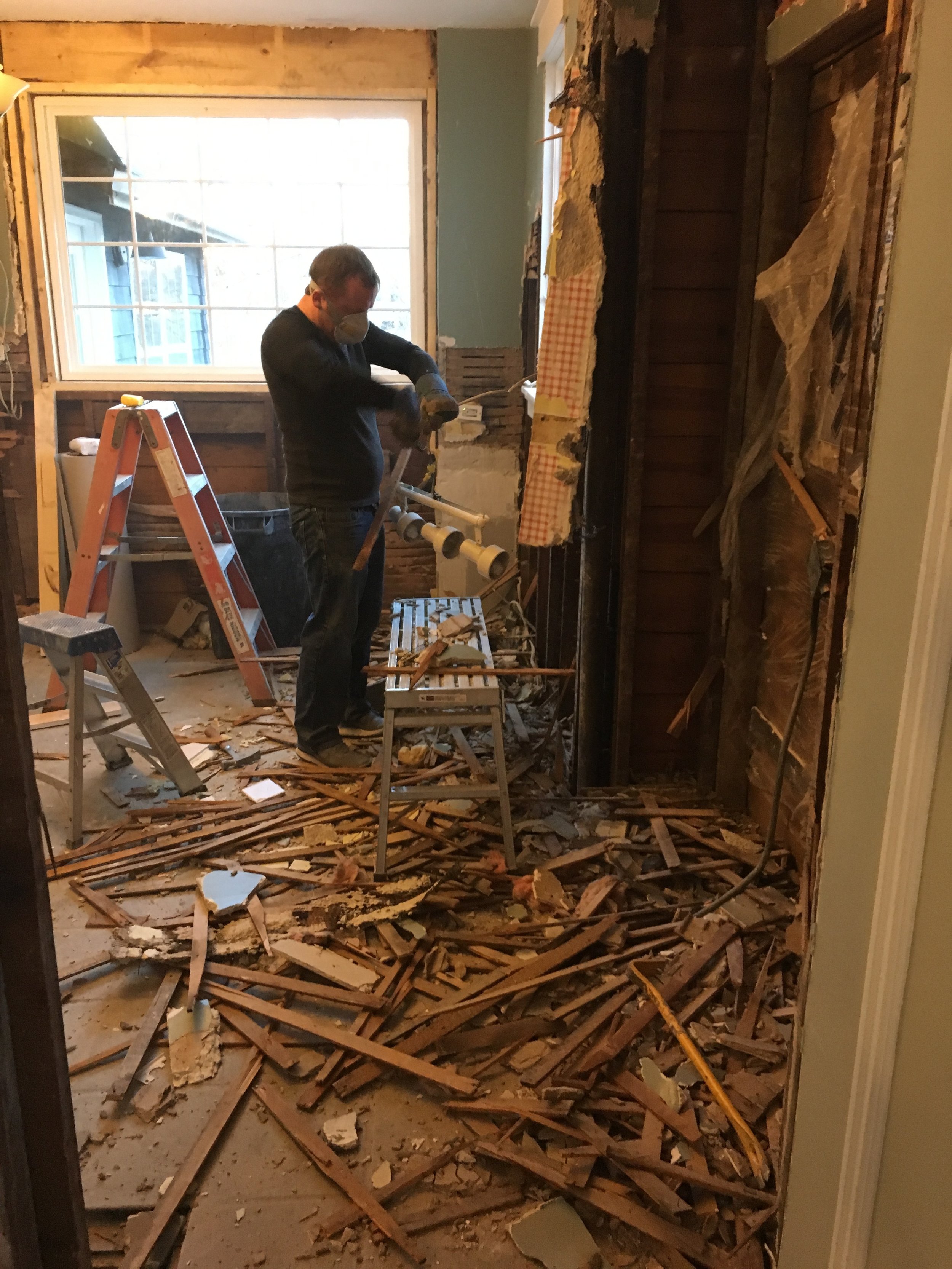
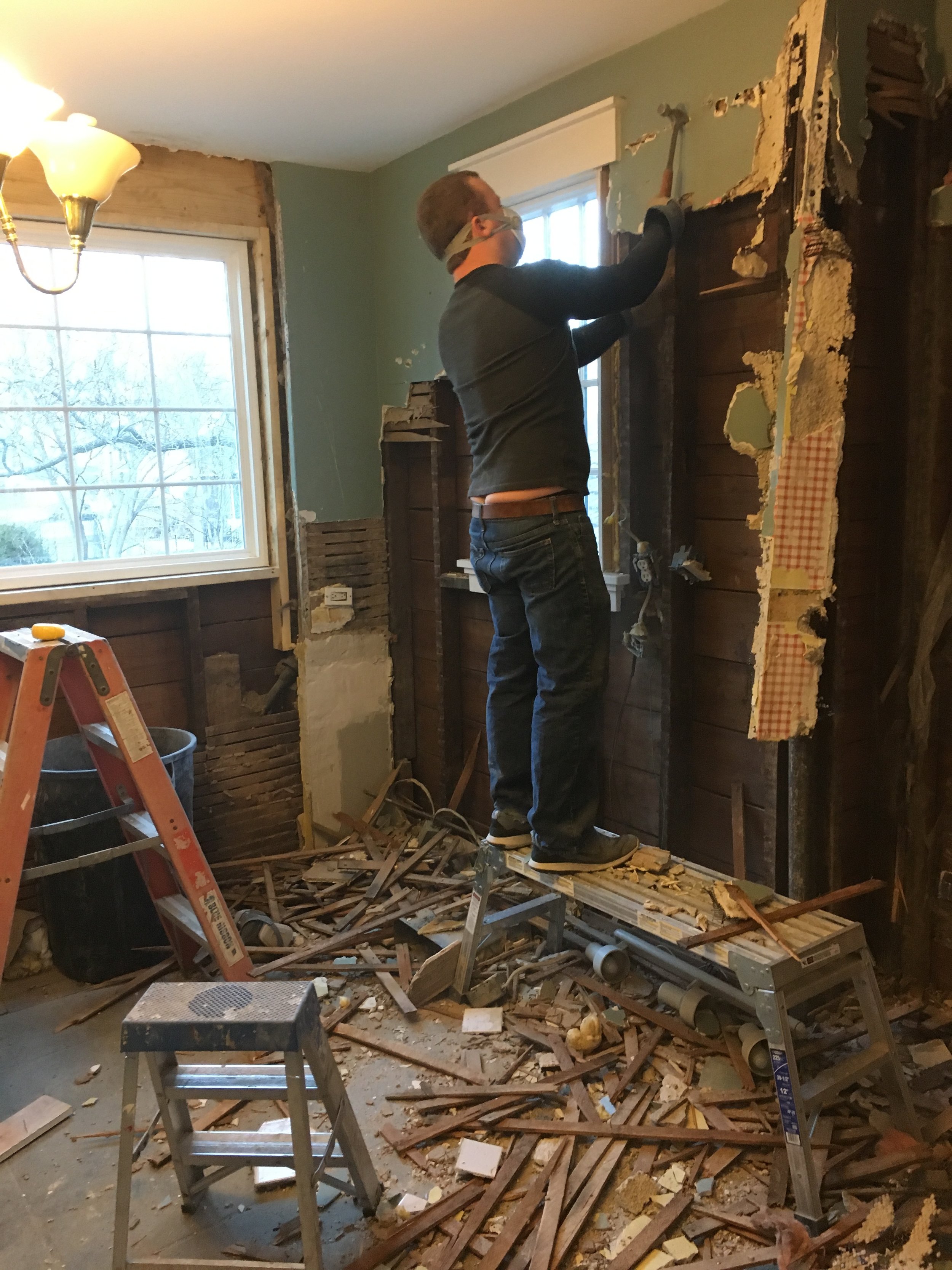
Starting the demo process.
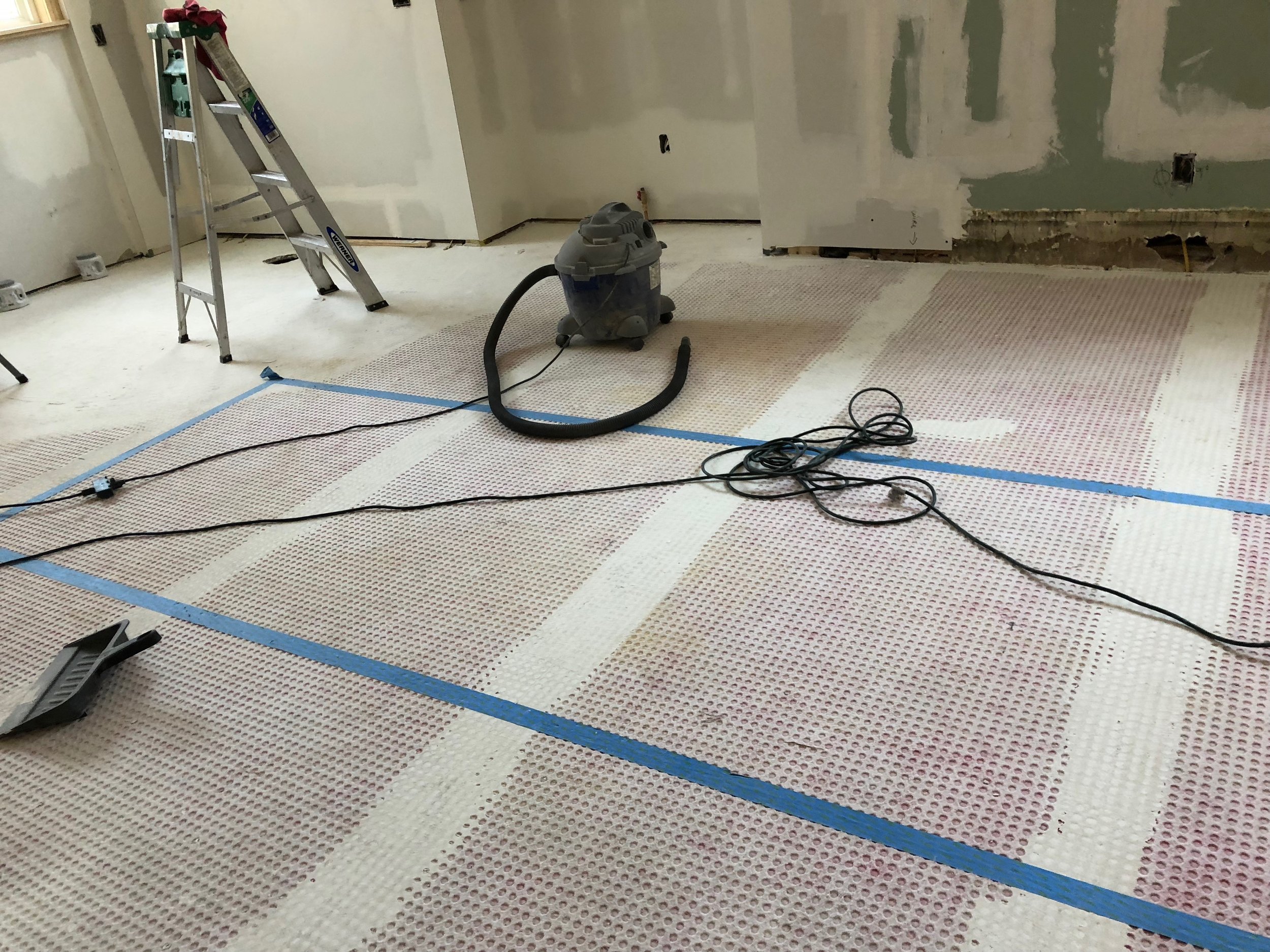
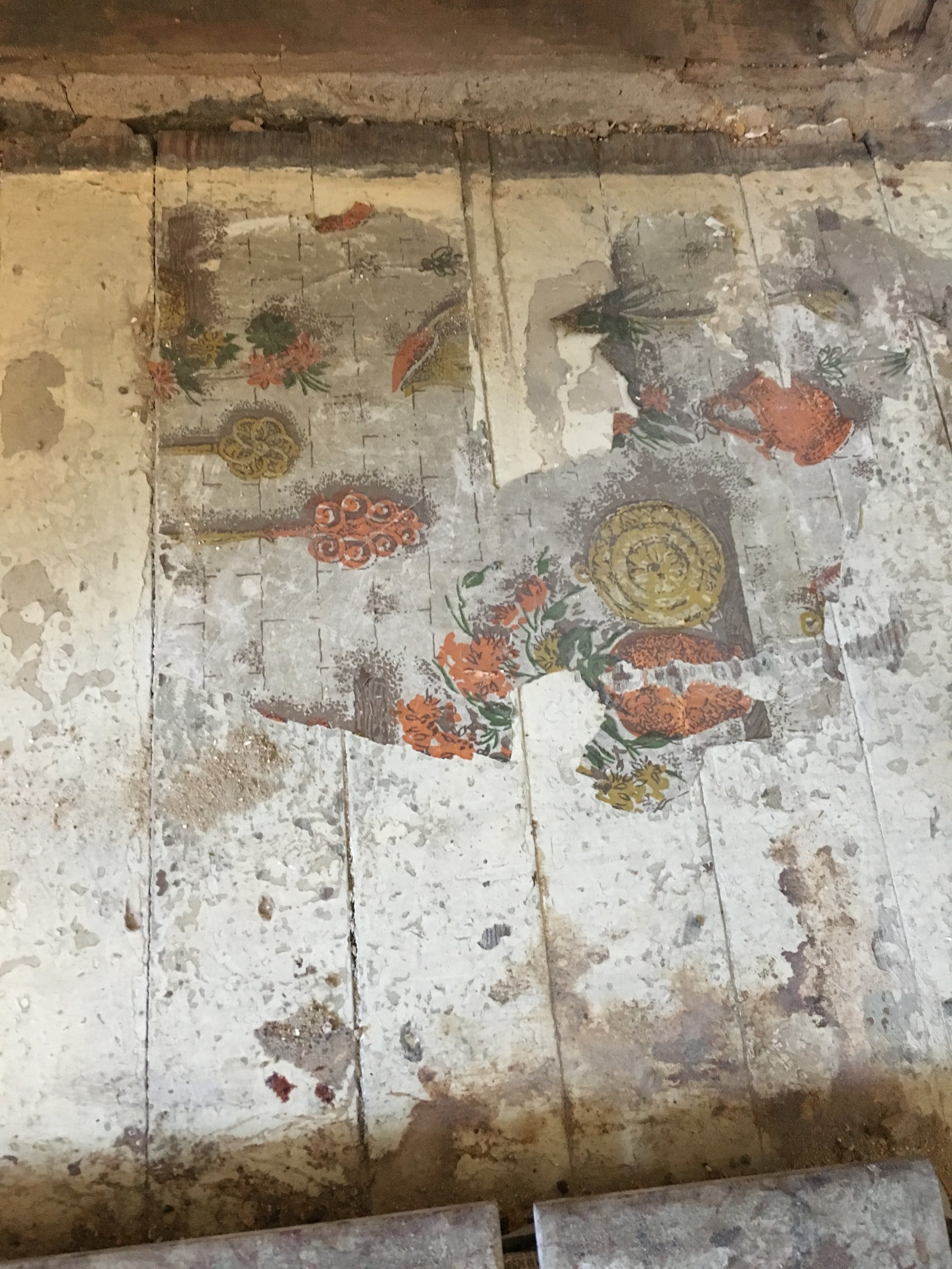
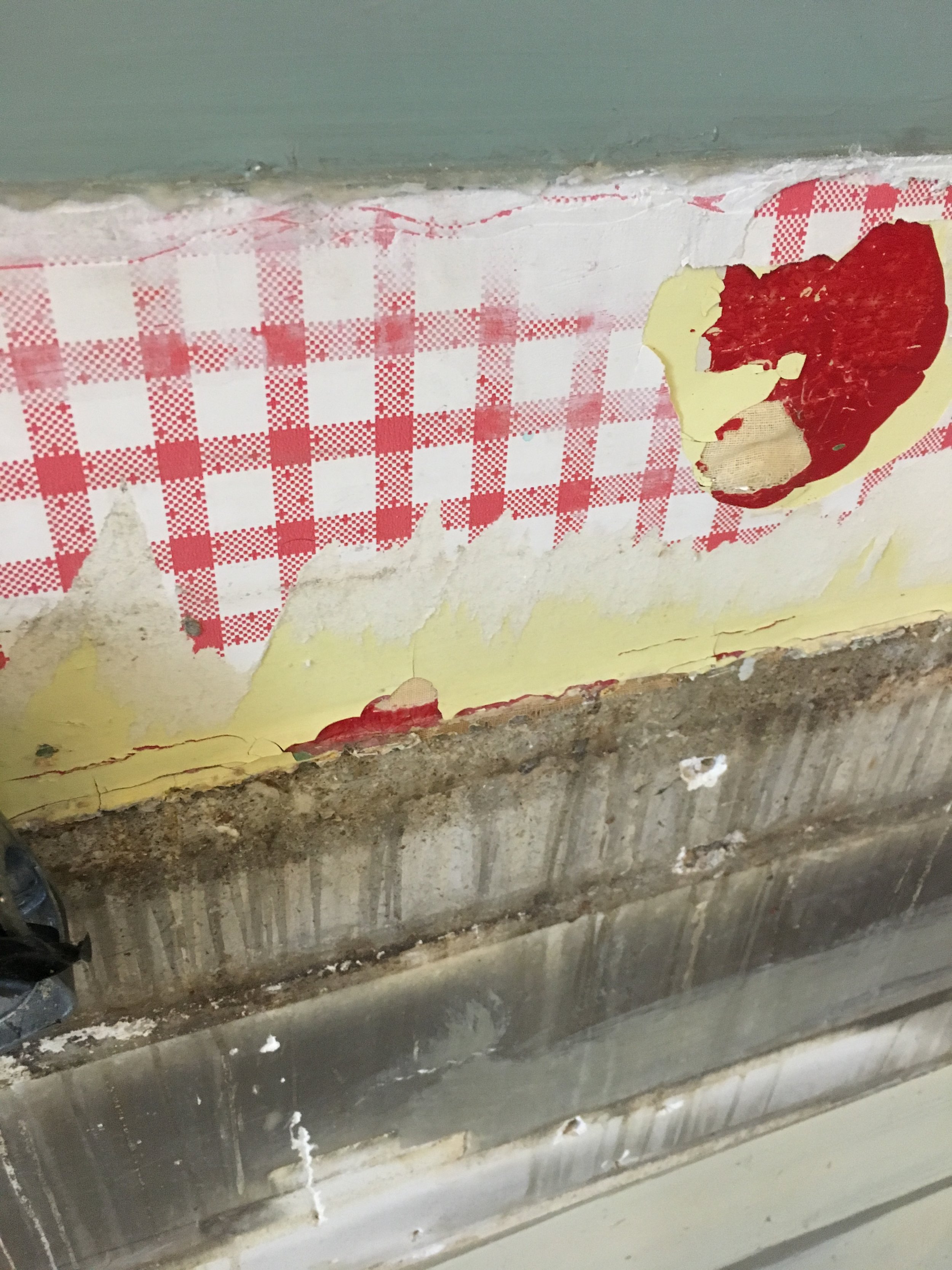
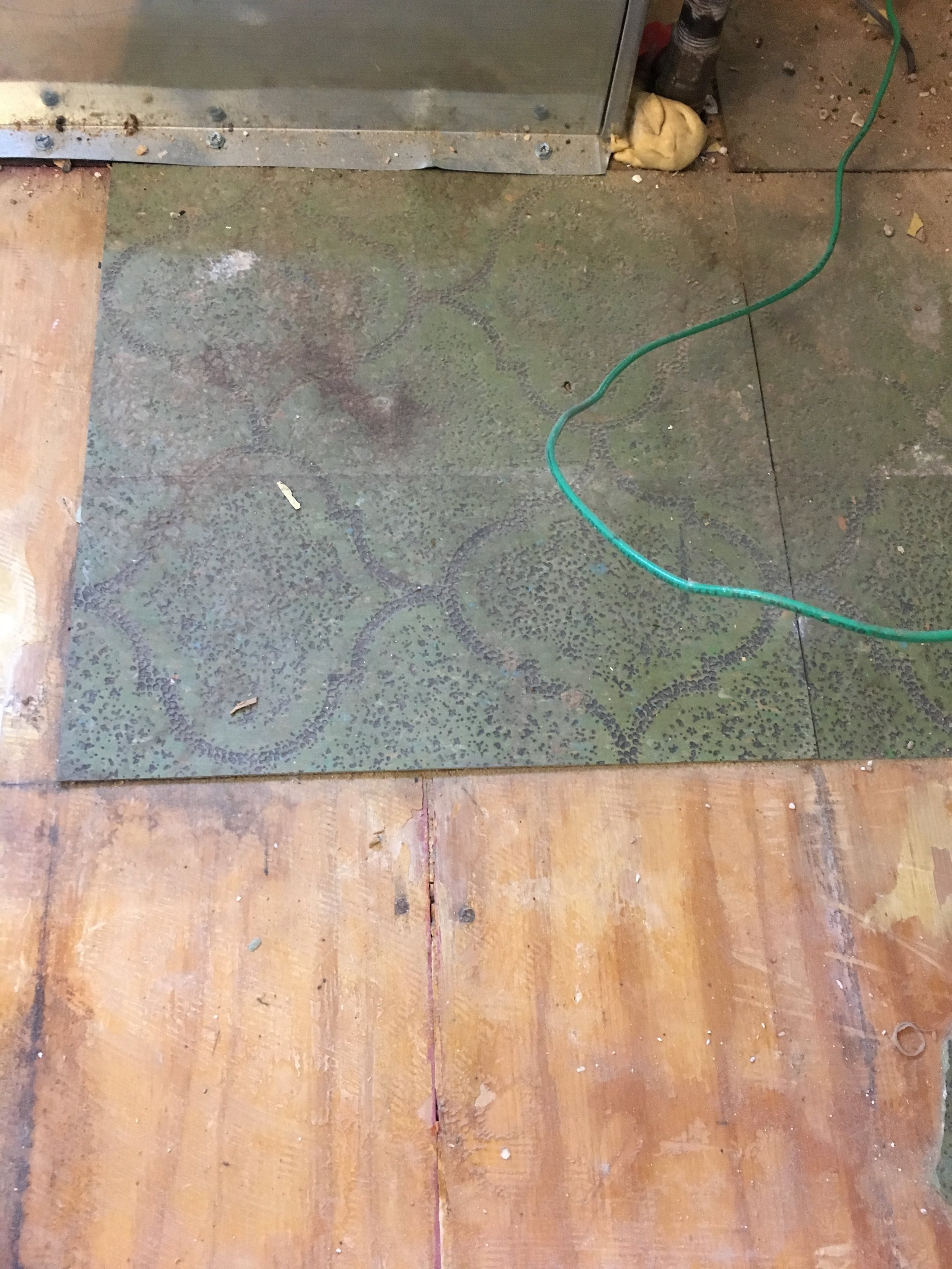
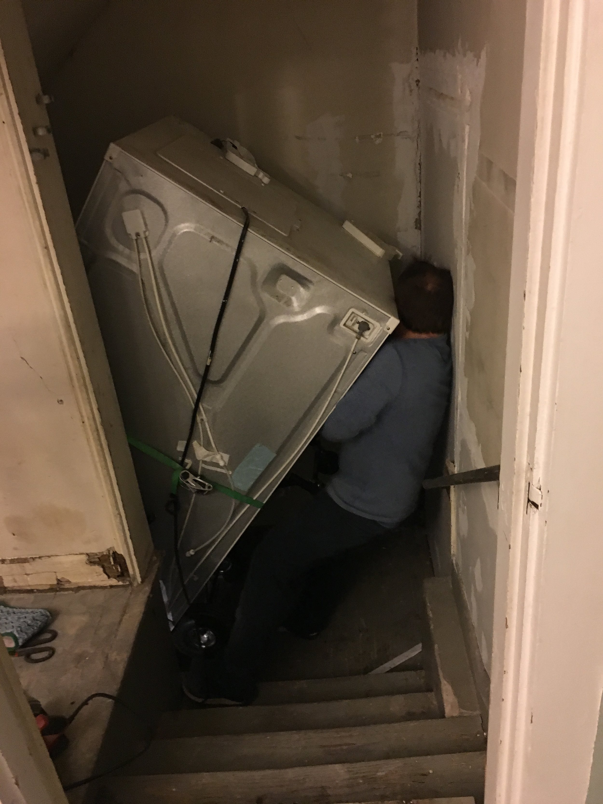
We found a contractor that was recommended by a friend. He took down the wall between the dining room and old kitchen, removed the old flooring and leveled what would be the new sub-floor, and hung drywall.
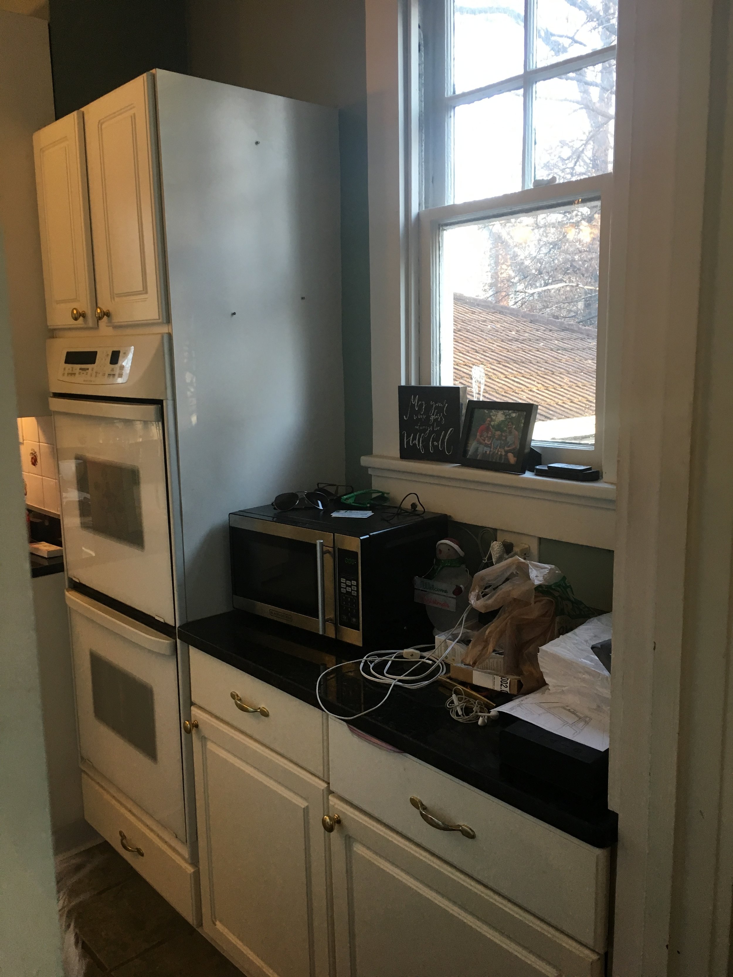

We had several cabinet designers come over to give us ideas on layouts and bids on their cabinets. We found Toni Paur from a friend. She started her own small business a few years ago after spending many years at RSI, A la Carte Home Design. She is the mother of 2 young kids and she spoke my language when it came to organization, maximizing space, and making things easier. She was a blast to work with and very attentive to our project.
Next, Rebecca Stisser comes in. Our tie breaker, marriage counselor, reality check, and motivator. All of the decisions were so overwhelming and we needed someone to refocus us and help make some good choices, like not putting the sink under the triple window so everyone can see our dirty dishes right when they walk in. Or teaching us the mantra of keeping it classic and timeless, straight lines, metal goes with metal, and so many other nuggets of great advice.
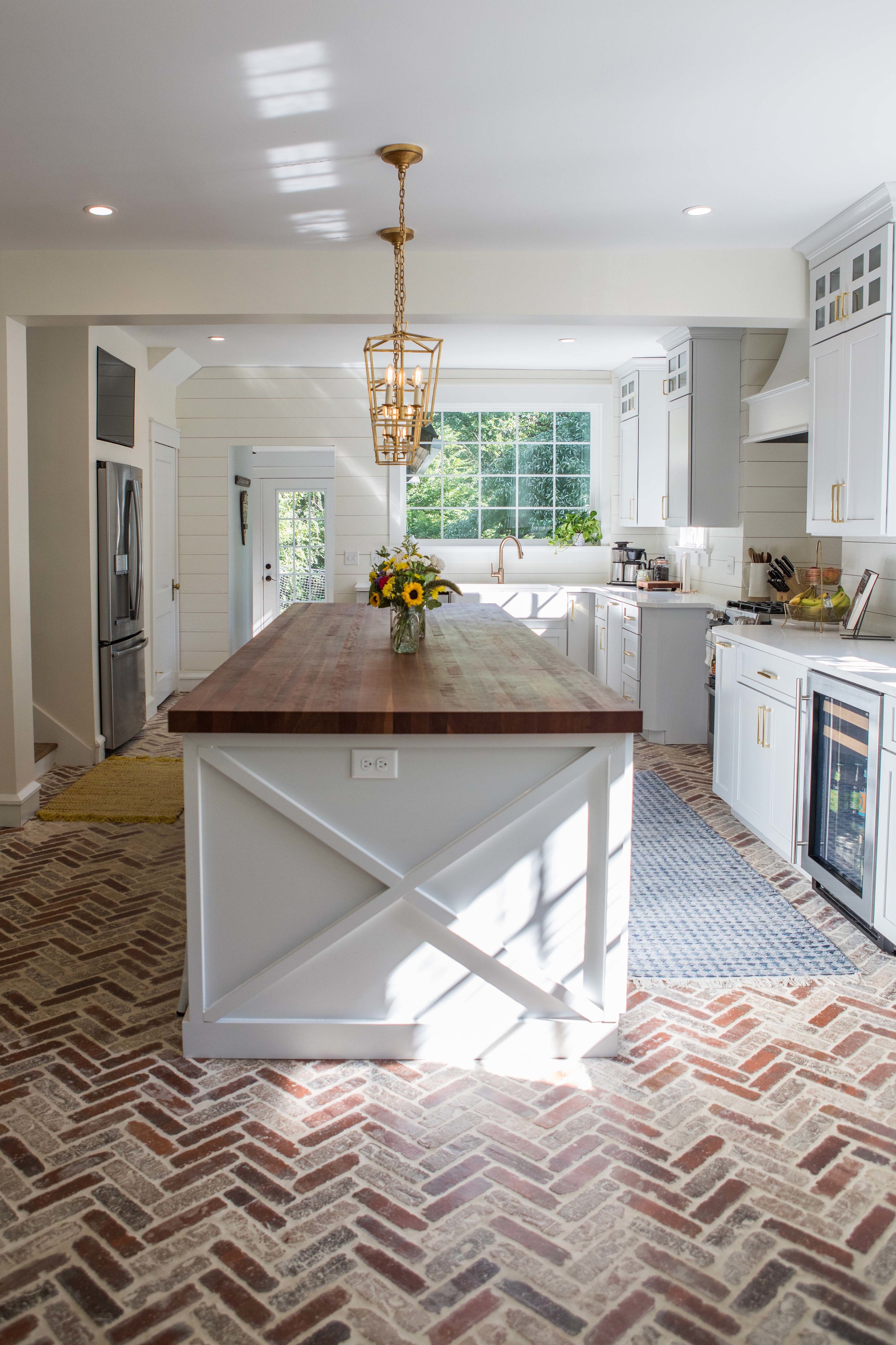
After
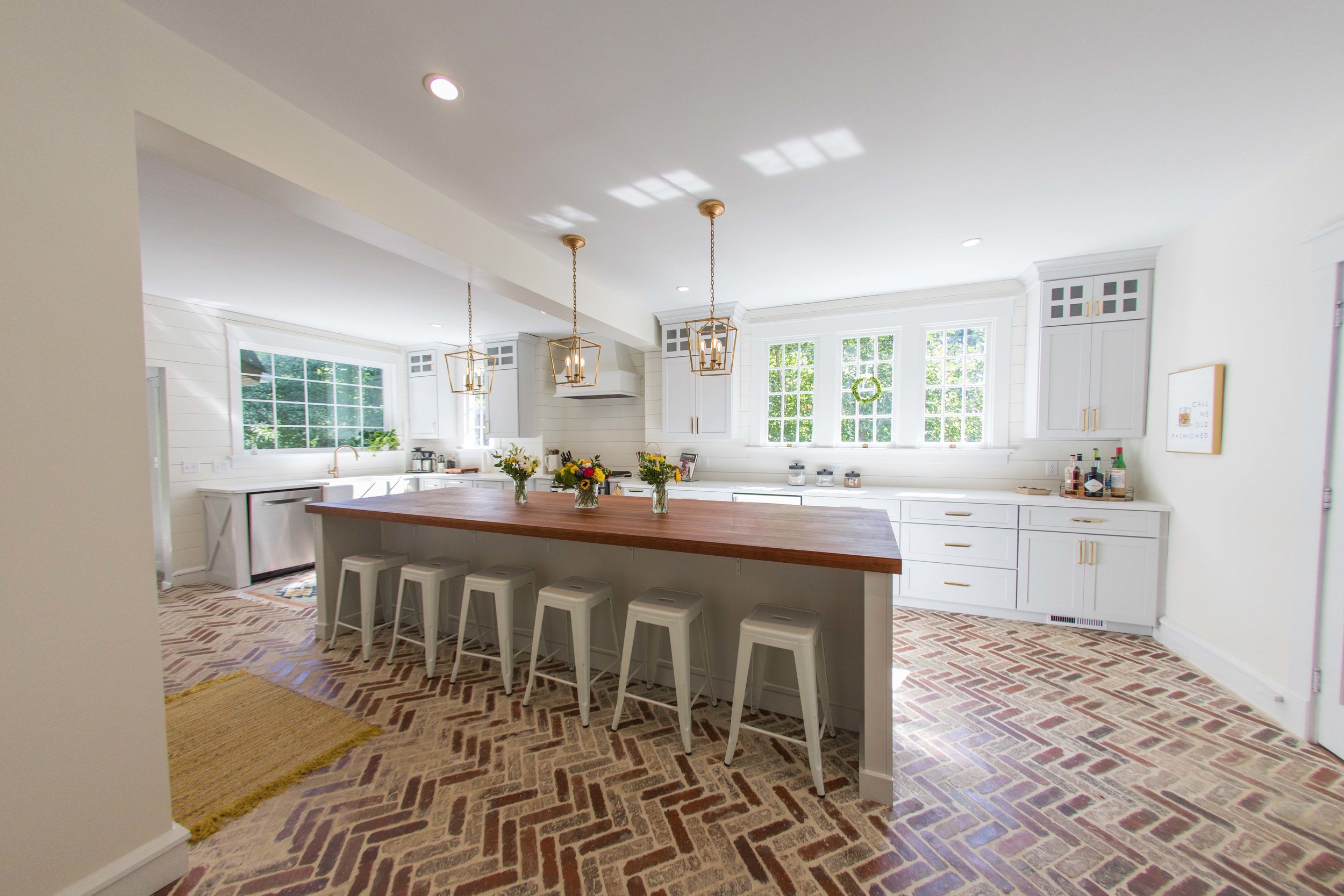
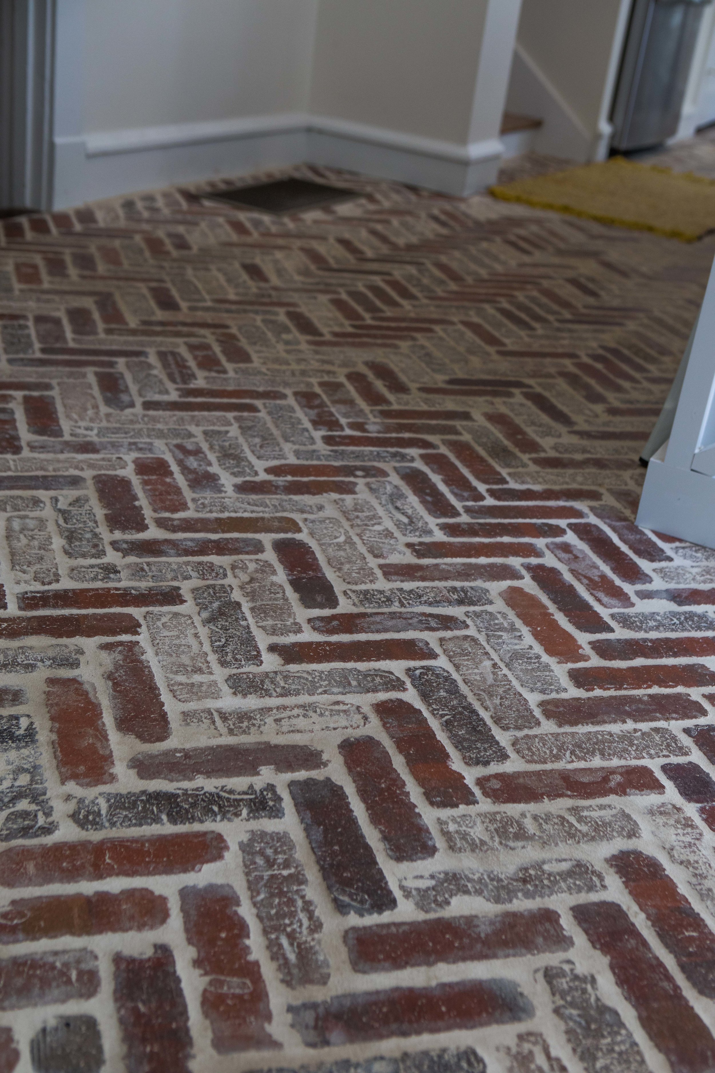
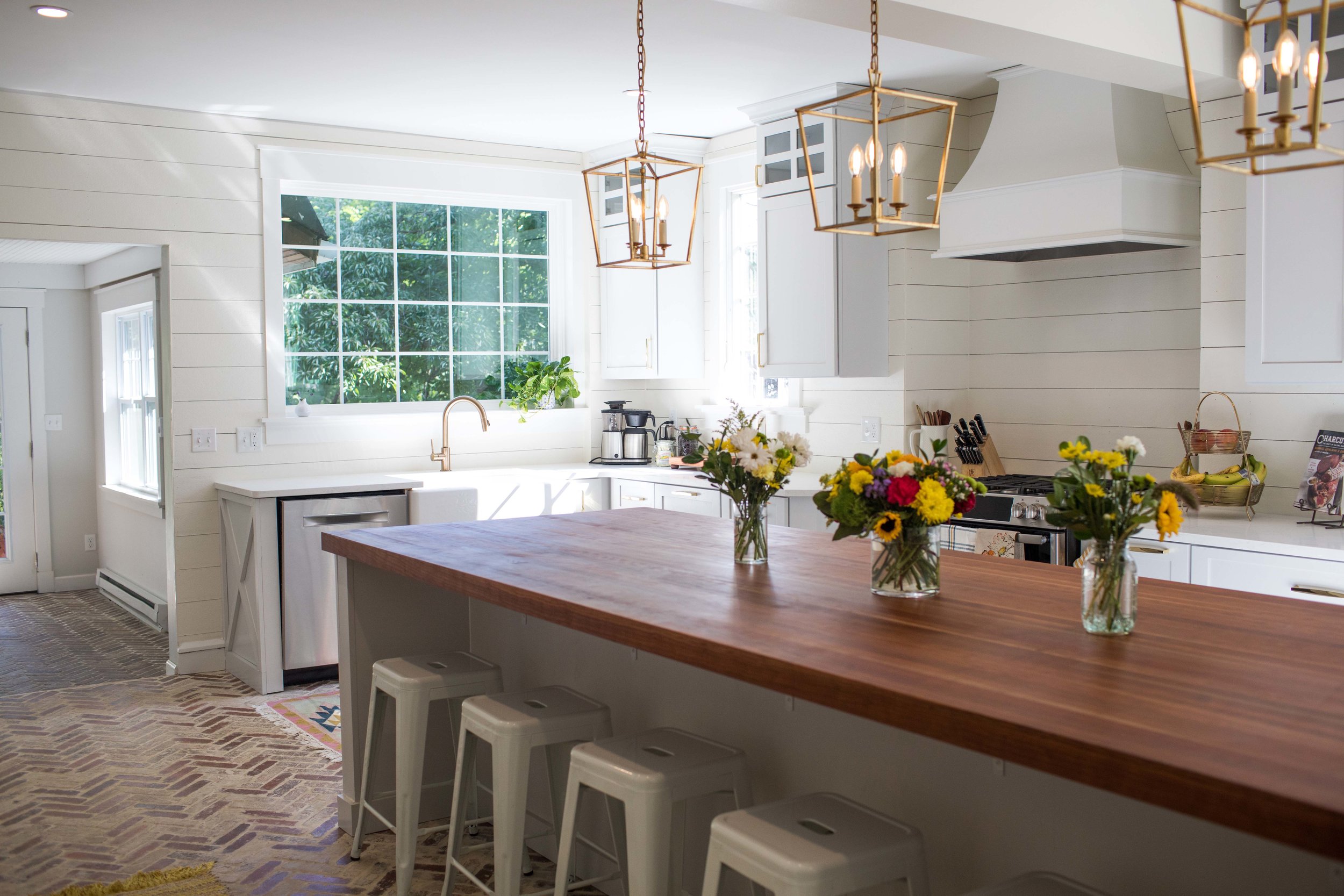
This was a labor of love. Literally blood, sweat and tears. We did a ton of the work ourselves, like laying over 3,000 individual bricks, or hanging feet upon feet of hardy board to create the shiplap. What we did outsource, we tried to use small business owners in the community. We wanted the entire project to be meaningful. One of my favorite things we did was add the big picture window above the sink. It did not cost much, but made a huge difference. I also really appreciate the TV above the fridge (Thanks, Rebecca). But only because it is recessed and you don’t really notice it.
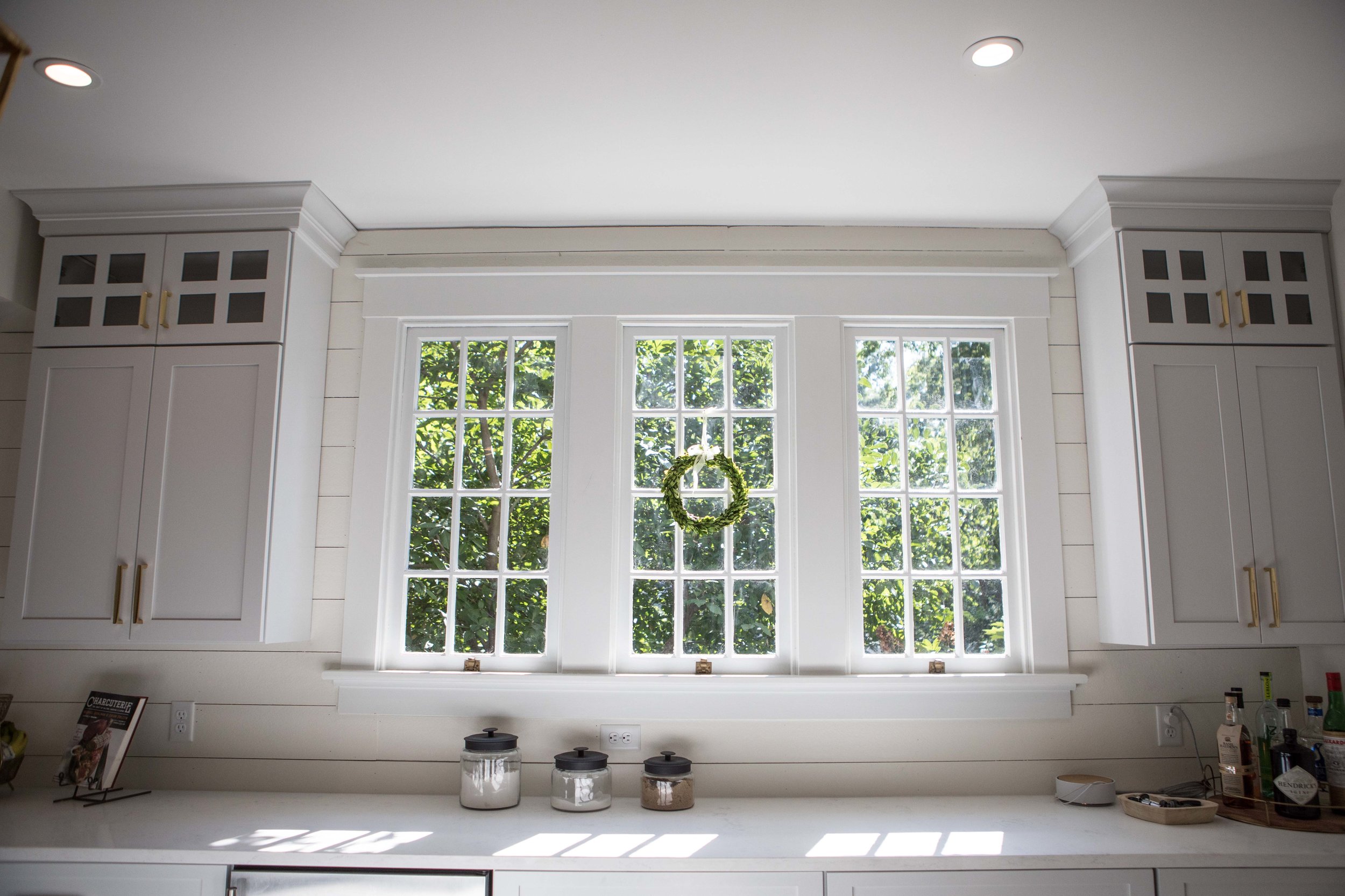
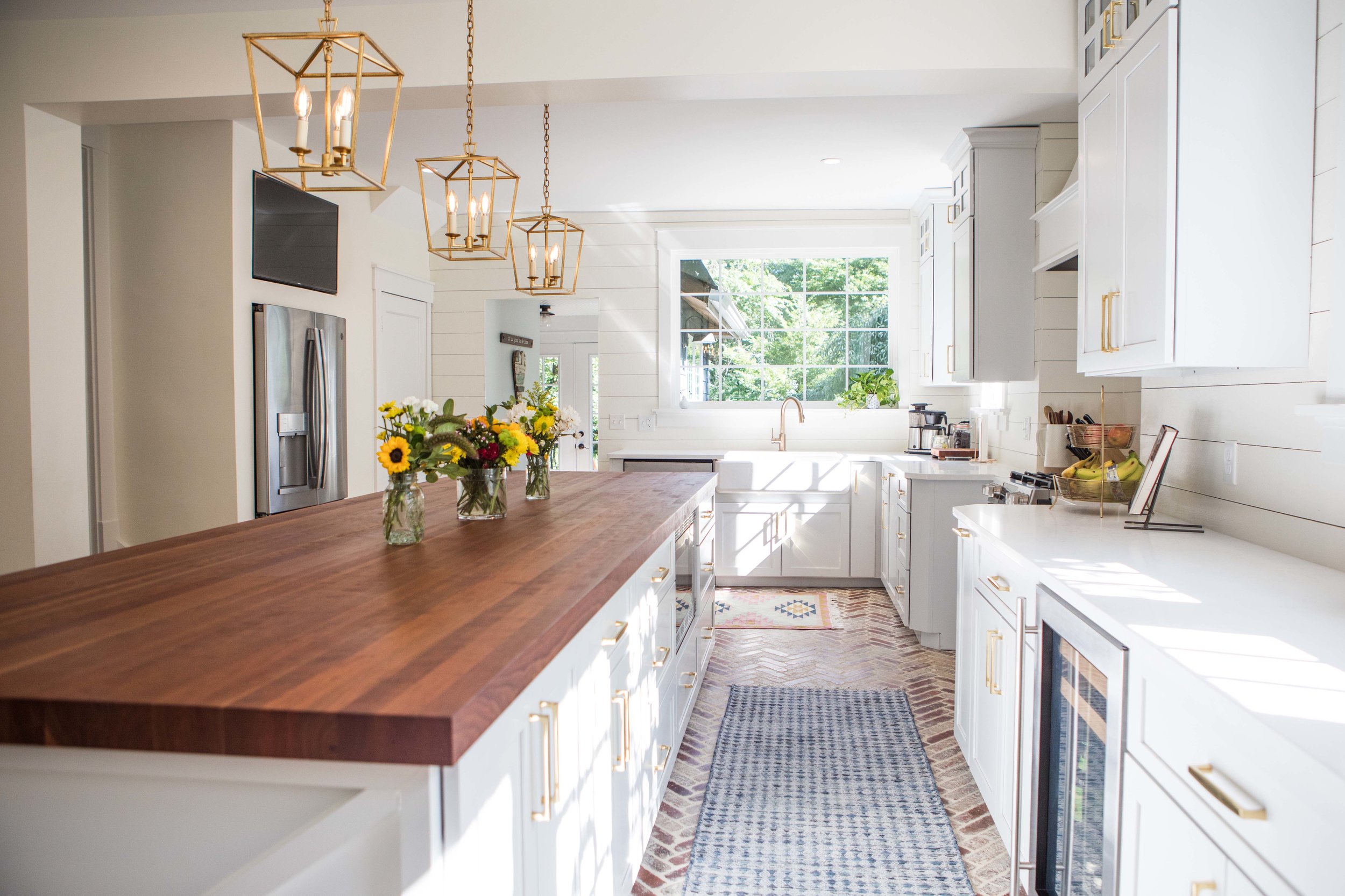
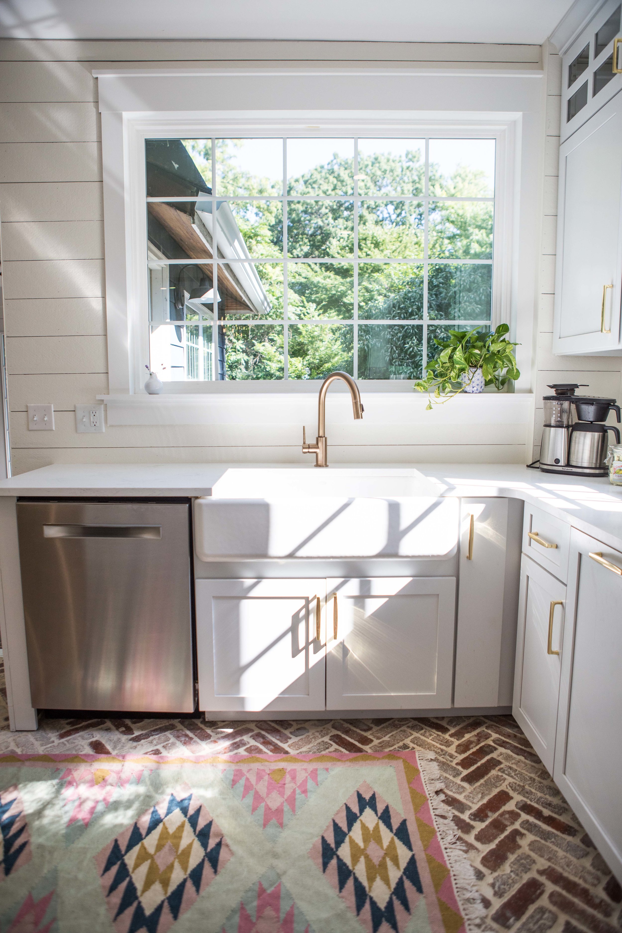
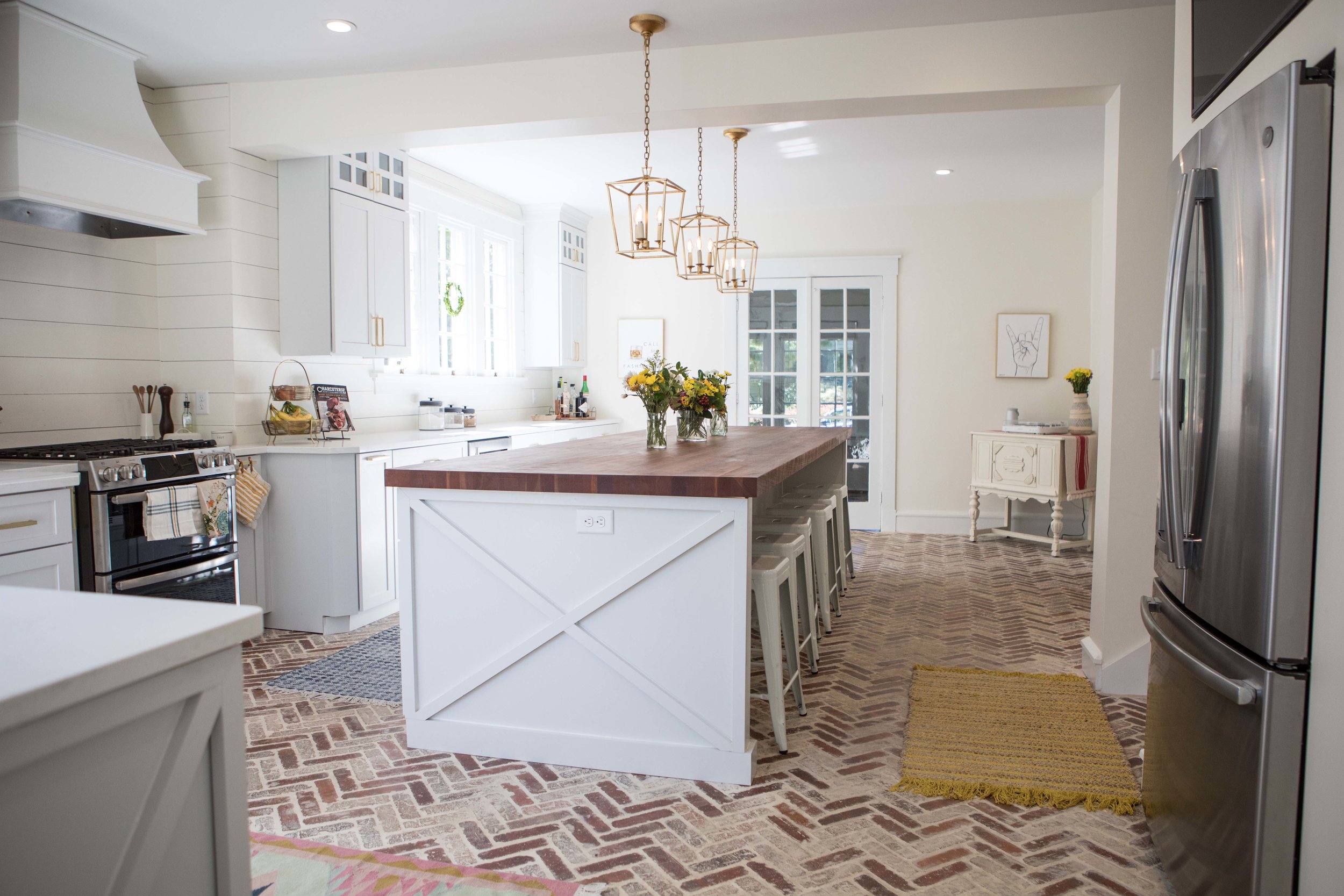
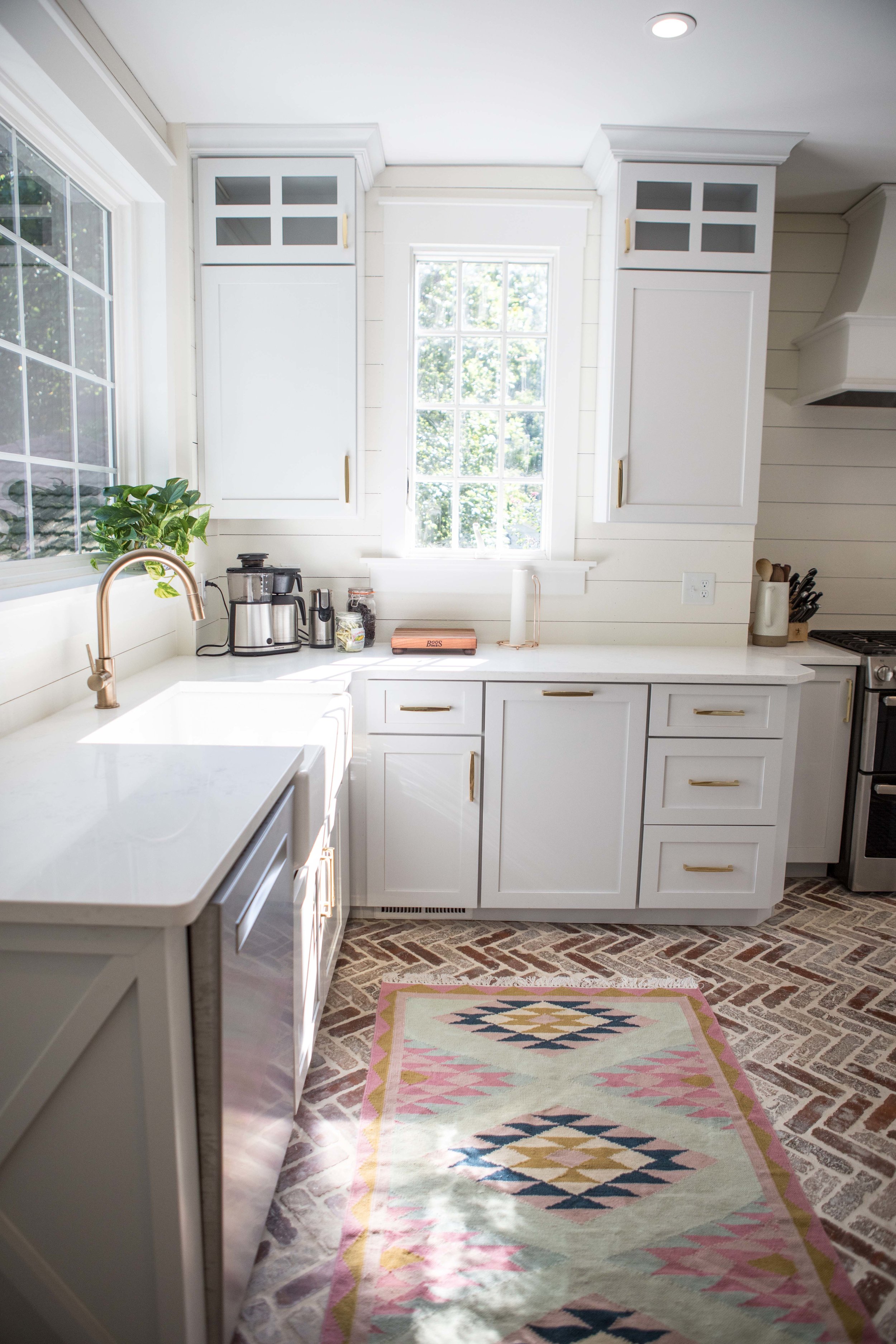
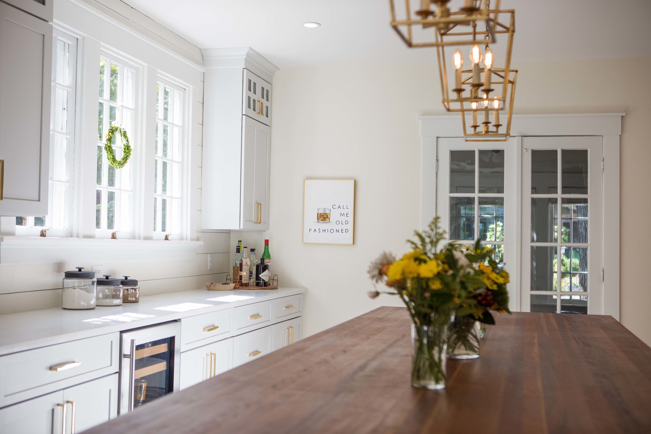
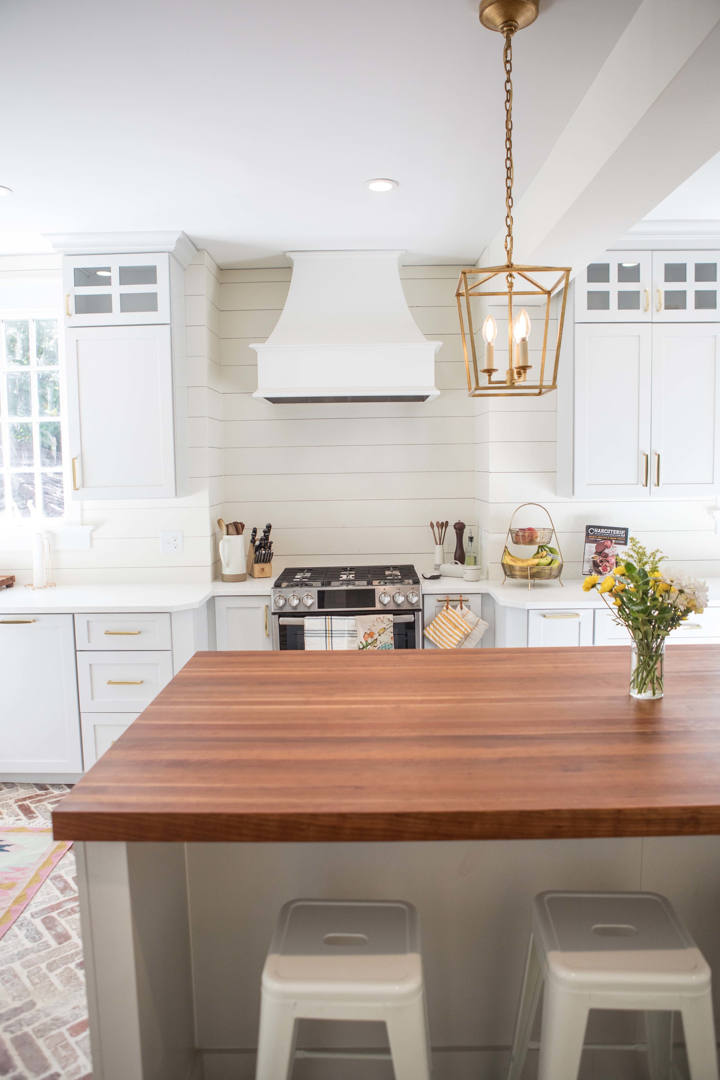
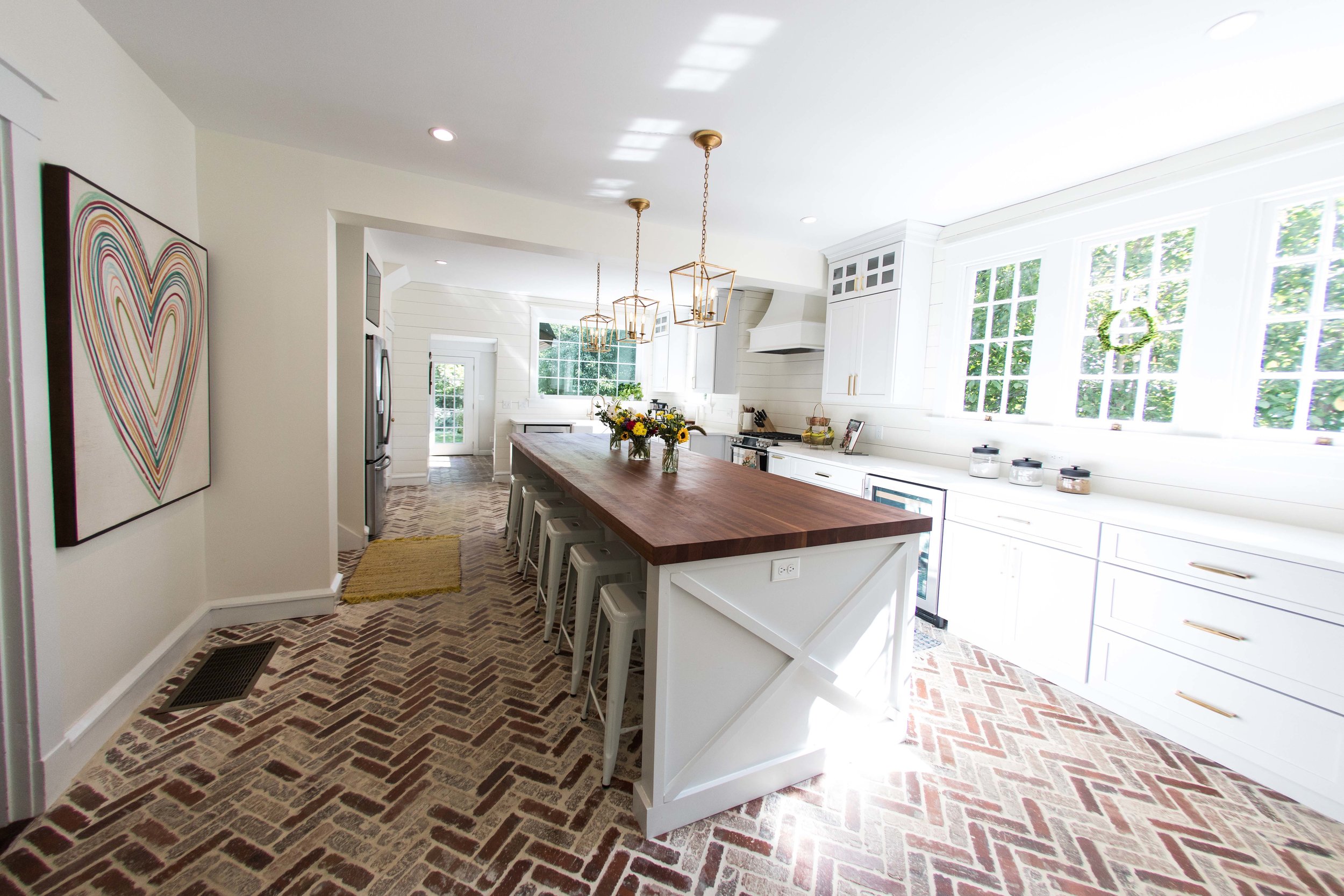
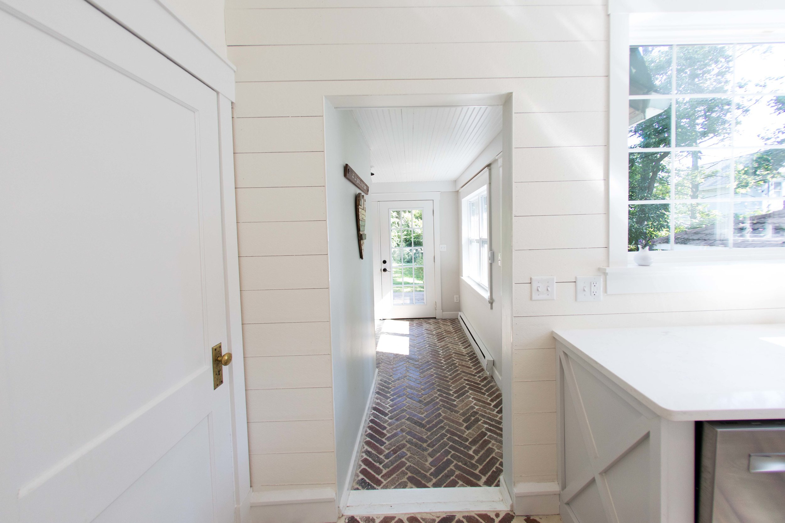
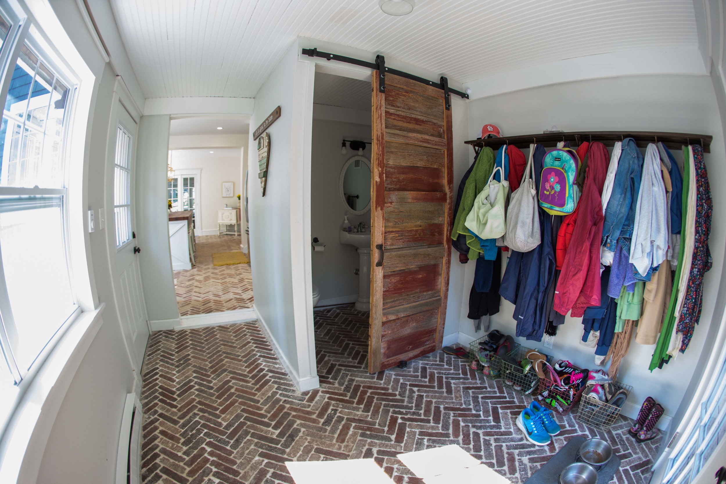
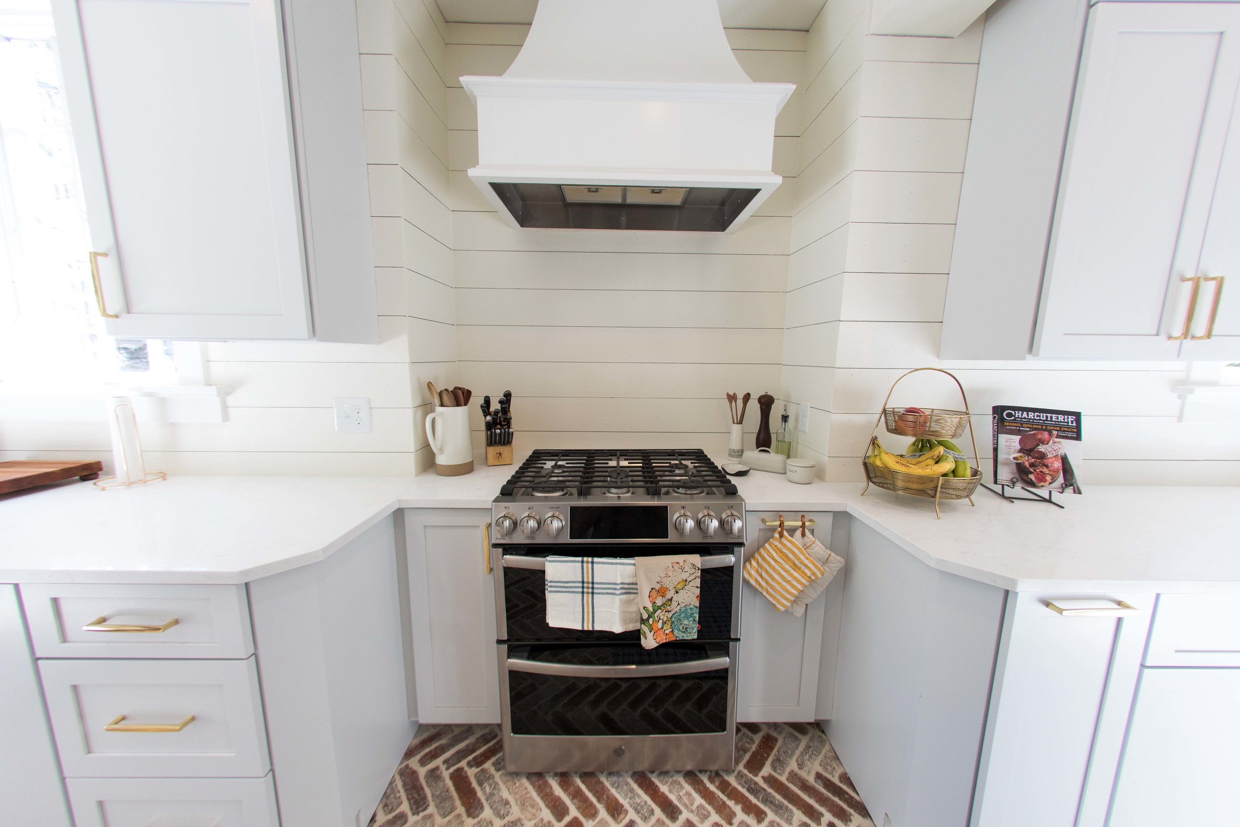
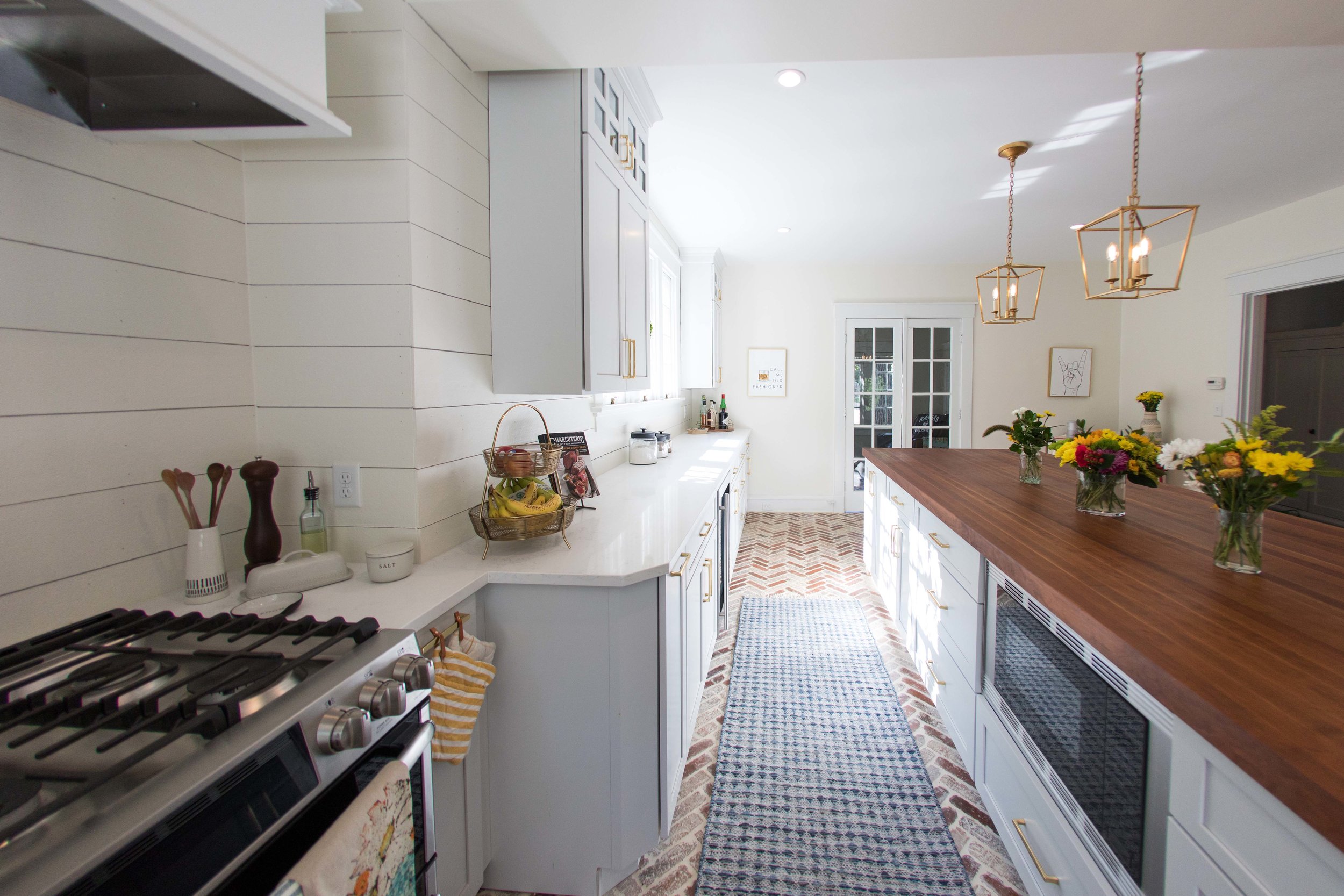
Details
Inspiration: Becki Owen www.beckiowens.com - She has a section dedicated just to kitchens and we bought items directly from here like our brass Kohler faucet
Flooring: Old Mill Brick Colonial Collection Castle Gate brick flats - Home Depot – Inspiration came from Angela Cramberg, our first neighbor and soon to be lifelong friend. The first time I saw her house 11 years ago I fell in love with the brick floors in her kitchen. I told Michael, when we find our forever home I want brick floors. Now I have them.
Island Top: John Boos – Custom made 12’, 2 ¾” thick cherry wood unsealed top. They sell through many outlets, but they are made right in Effingham, IL. We ordered direct and picked it up ourselves to save a ton.
Exterior Top: Quartz in style of Pinpoinl - Titan Granite
Cabinets: www.alacartehomedesign.com Toni Paur – Bridgewood Cabinetry, Downey paint finish, Mission door style.
Sink: Kohler Whitehaven Undermount Farmhouse sink - Home Depot
Faucet: Delta Trinsic Pull down sprayer in Champagne Bronze - Home Depot
Pulls: Palm Springs Estate Collection in Polished Brass - Build.com
Lights: E F Chapman Darlana Mini Lantern in Gilded Iron - FoundryLighting.com
Walls: James Hardie Hardie Plank cement siding 6.25 in x 144 in - home Depot
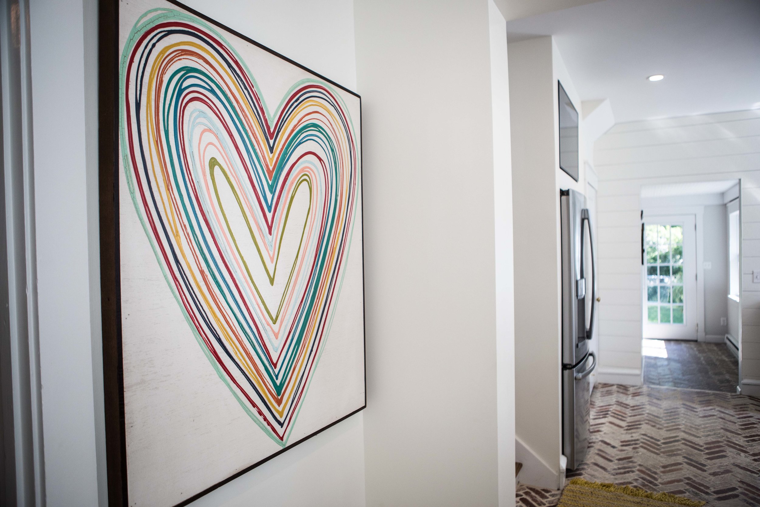
Art Work: Big Heart – Little Red Porch. I saw them at the Vintage Market a year ago and loved it but had no space for one. Detective Byrne tracked down the artist and linked her to Happy Camper Co. in St. Charles. She custom made us that size and the owner of Happy Camper picked it up for us an brought it to her store.
“Call me Old Fashioned” and “Rock and Roll Hands” were hand painted by our neighbor, Jenny Hannel.
Runners: Long blue runner – Pottery Barn, Small runner in front of sink – Lu Lu and Georgia - I like the warm, bohemian feeling of having runners and rugs. I think I want to add a few more J
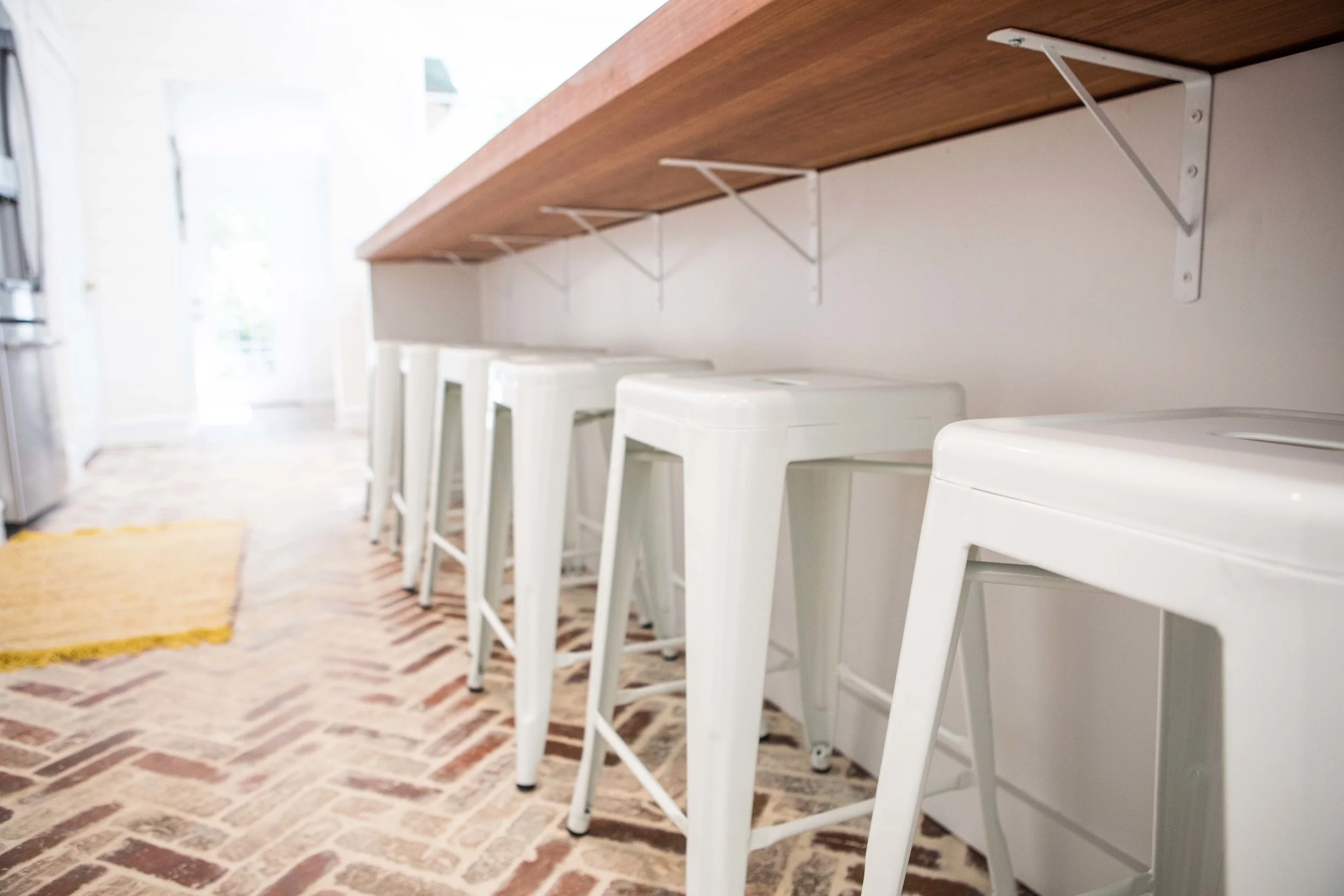
Stools: Amazon – Best Rebecca idea ever – buy inexpensive stools that aren’t going to drive you crazy. The kids dirty hands are all over these things but they wipe down, push under, and stack. Maybe one day we can have nice stools, today is not that day.
Backslash: Hardie board hung with nickel spacers and painted. We decided after putting in the herringbone brick floor with the large amount of backsplash that would be needed in the space, doing tile would make it look like too much going on. We like the look of shiplap via "Fixer Upper" but were concerned about putting wood in a kitchen with a gas stove and near the sink. We found a couple of blogs which gave the idea of doing it. After some trial and error, we decided to go for it and painted the hardie board, flipped them where the backside was showing, nickel spaced and pin nailed them into the studs.
Paint: Benjamin Moore Dover white


